NME - Special Edition
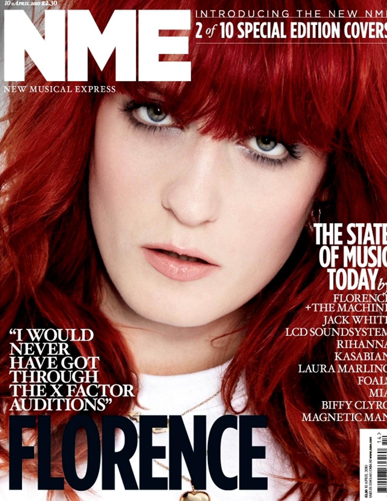
The title of the cover has kept the original font, however the new colour of just pure white which makes it stand out and is effective due to the fact that the use of a red font would inevitably collide with the hair colour of the artist. The page itself is interesting as not only does the artist itself make a relationship with the reader by having eye contact, but the informality of the term 'florence' produces a certain comfortability with the reader. The close up reinforces this comfortability as the only time you would be as close as the reader is, is in person. The general layout of this cover is minimal but also quite formal, this gives me a few ideas for my own magazine.


NME #2
This cover is interesting. The top of the page has a list of music artists of a certain genre, while the main artist is of a different genre, this may be a marketing technique to widen the audience. The central image itself is very attractive due to the fact that the background is very complex with a large collection of colours while the artists clothes are very simple, with a simple white vest and gold chain. His eye contact and wide smile creates a very positive connection with the reader, even though the background would not be a factor in my magazine, the positive connection with the reader is something i will aspire to. His wide arms also may be a technique to try and make the reader feel that the artist is very open and relatable. The quote on the bottom left is in a very informal way which makes the younger target audience feel more comfortable and gives them a dialect to relate to. This will then inevitably intrigue the audience and make the reader feel a certain need to read the magazine.
Billboard
This cover is very attractive for many reasons. For example, the big black font contrasting with the bright pink background makes it stand out. Speaking of which, the pink background emphasises the female target audience while keeping a very strict palette of pink, black and yellow, this collides with what the artist is wearing. Like most of the pictures of artists, the artist is making eye contact with the camera in an attempt to make a connection with the audience. The vibrant colours make the magazine stand out and create an attractiveness to it.
No comments:
Post a Comment