VIBE

The title of this page is very attractive with big and bold letters to grab the audiences attention. Connecting to the title is the artists legs, due to the fact that the legs lead up to the title is incredibly effective due to the fact that even though the sexual and promiscuous connotations attract the audience, they draw the readers attention to the subject of the page, which inevitably is the contents. This use of the male gaze is very effective however, I shall not be using this in my music magazine as it would not suit the style of my intended magazine. Something that I do find effective and slightly interesting is how the artists outfit interlocks with the background. This is interesting due to the fact that it shows that although the artist is there to be looked upon, she doesn't draw too much attention away from the content on the page. Also, the fact that she is making clear eye contact with the audience in a mysterious and unassuming way which inevitably draws the reader in and gives the reader in some way a personal connection with the artist, which then creates a connection with the magazine itself. Referring back to the artists legs, the fact that they are shaped as a v in my opinion is no coincidence. I believe that it represents the magazine as a whole and says to the reader that 'if you enjoy this page, you will enjoy the magazine'. This is because the v in my opinion is a reference to the name of the magazine 'Vibe' and makes the name itself have an attractiveness to it, which creates future sales as well as the attention of the reader.

The page as a whole is very informative and easy to depict what the magazine is about, the change of font for 'features' and 'fashion' draws attention and creates a subject for the reader to look at and decide whether the magazine is for them without wasting time.
VIBE #2

This contents page is in some ways the same as the previous one, this is due to the fact that they both have a dark yet relaxing tone to them, however with this one, there is an attractive section of red on the page that gives the viewer a slight edge to the expectation. Like the first contents page, the artist is making clear eye contact with the audience in a mysterious and unassuming way which inevitably draws the reader in and gives the reader in some way a personal connection with the artist, which then creates a connection with the magazine itself. However, in this sense the mid shot of the artist depicts him in a very stern way. The black title is very unique, in the sense that unlike the normal contents page, the letters are not all on the same line. This makes the magazine itself seem not so stereotypical.
The V in the background in some ways may symbolise an arrow, as if it is an arrow to point to where the audience's attention should be.
The palette of the page is a light grey/a dirty white from the backing and the tweed blazer and brown from the artists skin colour with a black title that contrasts with the light tints at the backing of the page. This creates a relaxing feel to the page with the light grey however the darker tints give the page a masculine feel.
Like the first, the page as a whole is very informative and easy to depict what the magazine is about, the change of font for 'features' and 'fashion' draws attention and creates a subject for the reader to look at and decide whether the magazine is for them without wasting time.
NME
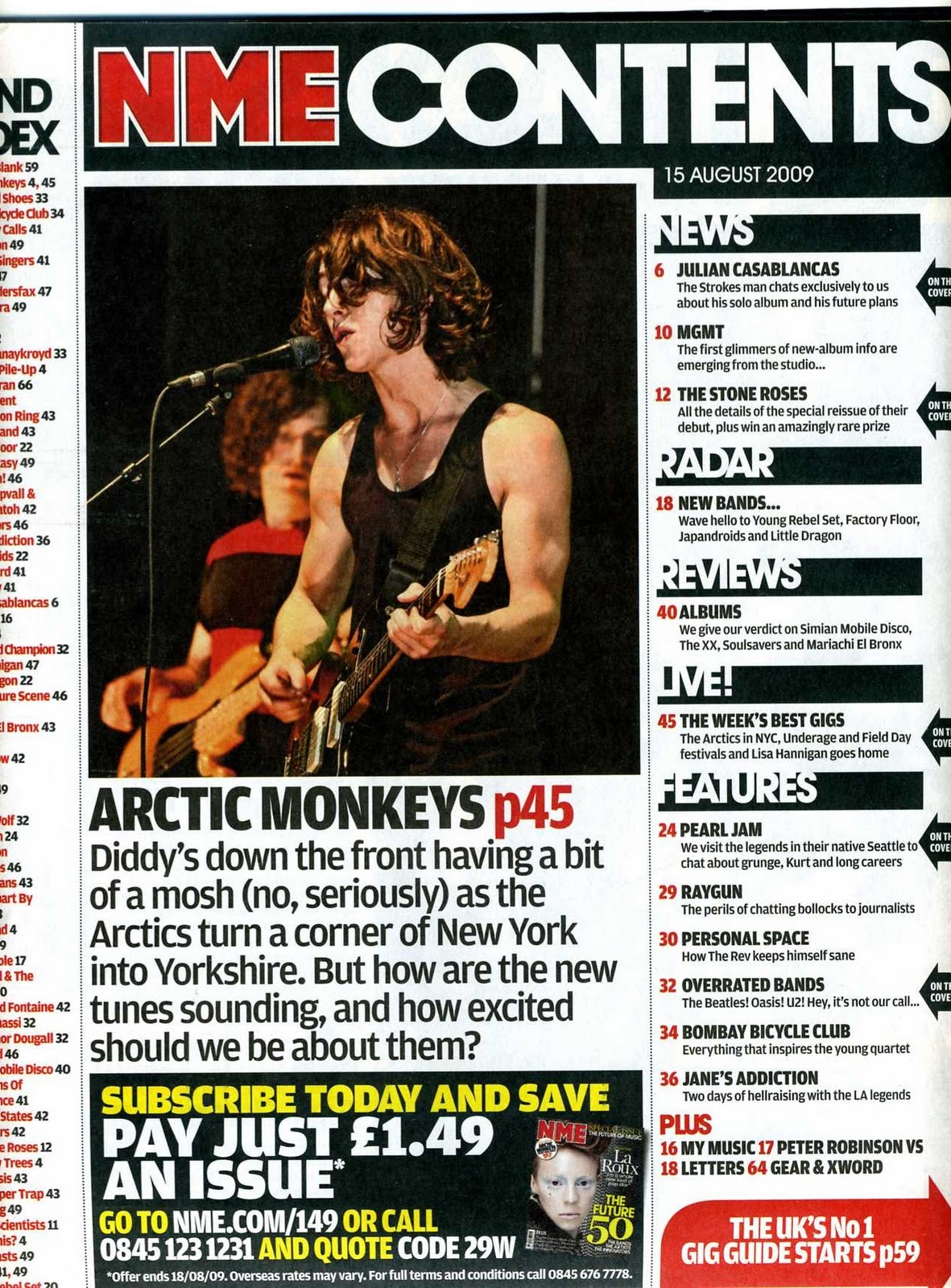
This Contents Page is in many ways opposing to the previous contents', due to the fact that on this one there is a lot more information and content on the page. Having both the magazine title in the original red and white lettering while also having the title of 'CONTENTS' causes both promotion for the magazine and reminds the audience as to what they are reading (as if they would forget). By using grids on their magazine contents, NME creates a certain structure and order to keep to conventions. This divides the subjects while making the page seem hectic and interesting. The language in the page is informal to try and relate to the target audience, the lack of diversity in font makes the text easy to read no matter who it is. The advertisement at the bottom of the page stands out dramatically, thanks to the contrasting black background compared to the standard white, to then the use of yellow and white text instead of black. Unlike the previous magazines, there is no connection with the artist as the artist is in mid performance. With the palette, by using basic colours, this eliminates a specific audience and tries to relate to a wide range of people.
No comments:
Post a Comment