Showing posts with label Two Page Spread. Show all posts
Friday, 17 April 2015
Saturday, 28 February 2015
Monday, 9 February 2015
Saturday, 31 January 2015
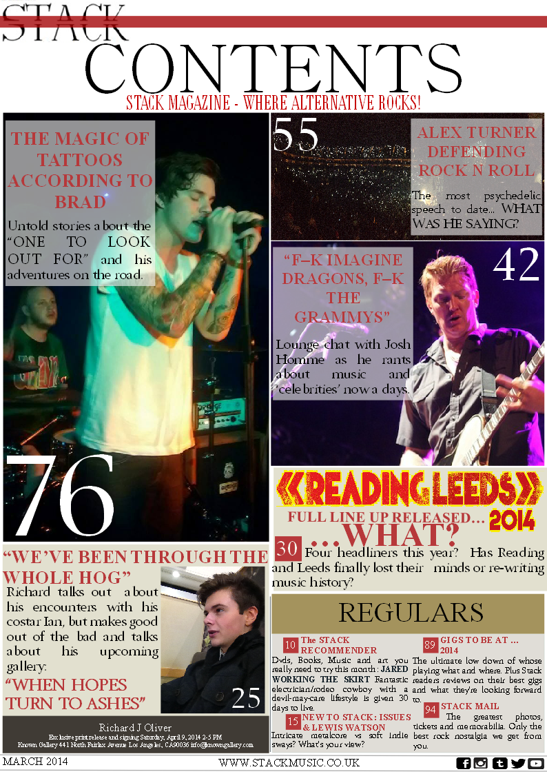
Draft Of Two Page Spread
Firstly, I had to change the layout of my design as a whole, this is due to the fact that their was too much content in the article to be able to fit in three small columns and be seen. I also made the picture black and white to make the artists all seem equal, as they are a left wing band. However, I created their album cover and decided to make the cover of the magazine seem to be the album cover. By also having the colour of the album cover contrast with the larger picture, this makes the album picture stand out. The reason I used the term 'Esc.' reflects the view that the British government creates Engineered Social Conditioning, creating a tower block for example that the government knows inevitably breeds crime and puts more working class kids in prison, which allows for the government to have more money. I also went with the term to resemble the keyboard icon 'Escape' this is because I believe that my artist would want the proletarians to escape from the ruling class.
The actual content itself had to be shortened, as there was too much to fit in the paper.
Something i did with the double page spread that I didn't do with the contents unfortunately, is the inclusion of page numbers. Unfortunately, the numbers i have used are not the same as those in the contents page.
Wednesday, 28 January 2015
Friday, 16 January 2015
Two Page Spread Analysis'
This spread has a colour palette that relates to the magazine due to the red and white resembling the title of NME, it also gives the page a simple and classy look. I do believe that this spread is effective, however the fact that the information looks as is it is alot of effort to read may push readers away from getting into the magazine thanks to a lack of effort, that and the audience research i did revealed that the people who stereotypically read this magazine are rather lazy. However, this formal layout that is a standard conventiontion with double page spreads may appeal to an older audience, making the popular magazine grow their audience. The title 'got the love' is very effective as it is a lyric from the artists song and in my opinion is a use of synergy as the font is the same as the artists album cover. The font itself is big and bold so it grabs the audiences attention. Her eye contact with the camera creates a connection with the reader. The fact that the artist is wearing a black, edgy costume that contrasts with the white background makes the artist which is the subject, stand out.
NME #2
The first thing that stands out in this spread is the disjointed title, which may be there to represent the article itself and the mind set of the artist. Personally, my magazine would not have a title taking up most of the spread as i believe that the visual page is not very expressive because of the title, it also looks as if the content is concealed, as if they are trying to push attention away from the amount of text which will repel a lazy audience. The palette itself is interesting as like the first analysis, the palette is red, black and white. However in this one the use of simple colour is used to show the priorities on the spread, which is the artist and writers name and the artist herself. The actual pose of the artist is quite relaxed which is reinforced by the connect making from the eye contact, creating a relaxed connection with the reader as if to say 'yes theres a lot of writing, but relax'.
Q
This spread contains an artist that is far from my music magazines genre, however i enjoy this spread. This is due to many factors: The picture of the artist is A4 and consumes half of the spread however, the fact that it is in a greyscale theme makes me think that it is a way to relate to a more formal, older audience due to the picture having a classy editing look. The photo also appeals to a male audience as the artist look borderline nude while also looking at the camera in a promiscuous way. The large and attractive 'L' anchors Q's colour palette and logo both in font and colour. The content itself is set out in a very neat and sophisticated way which is in my opinion a reflection of the audience that Q has. The layout is helped by the three columns and the progressive split in the article thanks to the large letters S and I that grab the audiences attention to be something like a benchmark. Overall i think the classy style of this spread with a simple colour palette is incredibly effective and something i wish to achieve with my own magazine.
Subscribe to:
Posts (Atom)