Showing posts with label DRAFT. Show all posts

Monday, 13 April 2015

Evaluation Question Four DRAFT

Who would be the audience for your media product?

Gender: Male and Female
Age: 20 - 29
Monthly Spare £: Less Than £125 (Helped me to decide on a price for the magazine, as someone with little spare money would want to buy an incredibly overpriced magazine.)
Personality: "I wish I didn't have to go to work every day", "I like to surround myself with a diverse range of cultures and ideas", "Across history, religion has done more bad than good". (All these things affected my magazine, due to the fact that the first statement shows laziness, meaning that although I previously said that it would be wise to have an intellectual magazine, there would still have to be little enough that the reader can be bothered to read the magazine)
Clothing Brands: Dr. Martens,American Apparel,Adidas (Allowed me to decide the sort of clothing my chosen model would wear.)
Magazines Read: NME and Vice (Gave me an idea as to what magazines would be good to take inspiration from.)
Indie Scenesters are dedicated to finding the newest music, exploring all avenues to get there – online, print, record shops, club nights and word of mouth. Staying ahead of the curve is a must, but it’s borne out of a genuine love for music – and this is what separates them from those more fickle dabblers and dilettantes, the Hipsters. For Indie Scenesters, there’s nothing better than discovering new artists and spreading the love.
Guitar music has seen its cool usurped by the rise in electronic-synth based music in recent years, and Indie Scenesters have broadened their musical tastes as a result. It’s no longer just about indie rock bands like Vampire Weekend – Indie Scenesters have embraced experimental, genre-blending artists like Four Tet. Yet, the Indie Scenester approach remains the same – it’s about championing independent artists rather than a specific genre, especially before the masses get in on the act. Potentially having their own music blogs and club nights (or at least dreaming of it), Indie Scenesters are more concerned with building up their vinyl collections than conspicuous consumerism.

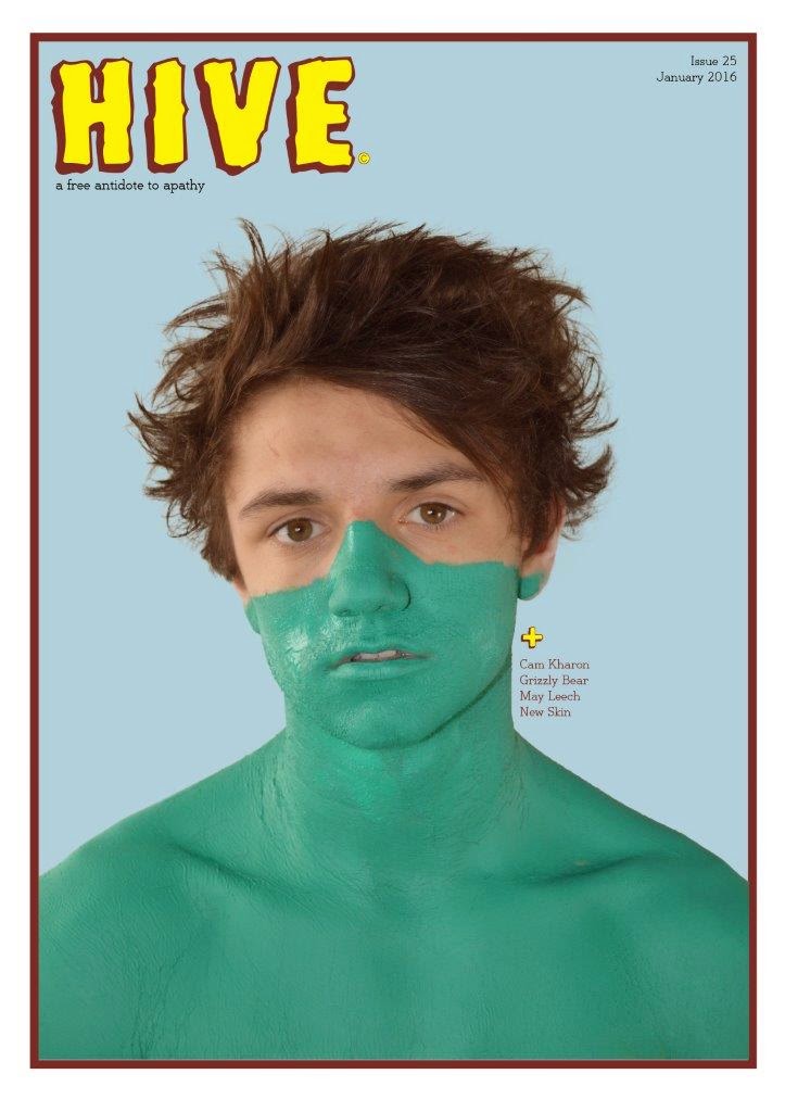
 - The reason as to why my magazine suits this audience is due to the fact that the artists involved such as Cam Kharon, like indie scenesters, have an appreciation of music.

Monday, 6 April 2015

Evaluation Question 3 DRAFT

What kind of media institution might distribute your media product and why?

The type of media institution that would be a likely candidate to publish Hive magazine would be Vice. This is due to the fact they already have a prominent status in the media industry, and in order for my non-commercial and magazine to be extended appropriately to a broad enough audience both print and through the web.
For this I chose Vice which have played a role in  entertainment enabling themselves to be well established and also have a lot of experience extending products to all over the world.

“VICE Media, Inc. is a youth media company and digital content creation studio operating in 36 countries. VICE has recently expanded from print building out a multimedia network, including the website VICE.COM as well as a network of international digital channels, a TV and feature film production studio, record label, magazine and a book-publishing division” – Due to the fact that Vice is a young media company I feel that the fact they have a very successful FREE magazine called Vice, this could be an excellent way to make my own free magazine just as successful, not only that but the Vice magazine is my main inspiration due to their non-conventional style and the success without a price.

Tuesday, 3 February 2015

Teachers Constructive Critisism on Draft Magazine


Cover
  • Look at Ratios, for example the hands are the same size as the head due to the fact they are closer to the camera. The way in which I will attempt to improve this is by taking individual photo's of the model and the picture in the cover. This will then be edited into the photo to make sure that the ratio's are realistic.

  • Consider Interests, to do this I will use the diagram drawn to make the polaroid picture be in the centre, making it the centre of attention. Also, due to the fact that the polaroid picture takes up the face of my model, this means that the connection made with the reader via eye contact, has to be made through the polaroid picture.
  • I also need to remove the barcode as my magazine is free.
  • The text o the right although aligned, still looks out of place. Therefore I shall try other variations in placements, colour, size etc.


Contents

  • The inclusion of other things, what I did on the two page spread, which I didn't on the others, is include the page numbers. Something else that I could add is something on the bottom border, such as the name of the magazine. This was inspired by Dazed & Confused and the fact that they do it in their magazine. Something they also do is put the page number next to it. This could be an idea as to what I do.
  • Focus exclusively on music. Although the news that I included was music related and the politics I felt would relate to a left wing target audience, it draws attention away from the brief of being a music magazine.
  • Also, the fact I have only used 5 numbers makes the magazine look unprofessional and makes the articles seem incomplete or just not there.
Two Page Spread


  • Sort out the ratios of the picture. To do this I may change the picture itself or change sizing etc. on photoshop.
  • I should also develop the titles font and keep the font used as only the covers masthead.
  • The font of the "F" also must be changed to make sure that the title of the page and the letter work well together.
  • The picture on the right is too dark. Therefore instead of using and black and white option, I shall lightly greyscale it to give the same effect. Just less dark.
  • The text beginning with "In a small flat" is poorly laid out and is linguistically too flat. While being too close to the page centre.
  • The body text: the spaces between the columns aren't equal in size. The margins aren't equal. The column on the right's text is bigger. It also is too narrow of a margin.
  • The design is poor on the CD cover, with the text being too big.
  • Also the text next to the CD cover is too big.