Showing posts with label Analysis. Show all posts

Friday, 16 January 2015

Analysis of Institution

Time Inc. UK

After a vast amount of research, an institution that would primarily publish my magazine is Time Inc. UK. This is the publisher of NME, which after a wide amount of audience research I described as the magazine which is most like the magazine I would like to make and has a target audience that will primarily be that in which I aim for. Time Inc. UK is a wholly owned subsidiary of Time Inc.
This publisher engages with almost half of all UK adult prints and their website has reached over 28million members, due to this I will have the benefit of the experience with this company which would benefit the making and marketing of my magazine. I also know that this is a very well accomplished company as In April 2012, Time Inc. UK won an award for Best Production Team of the Year at the Professional Publishers Association Production and Environment Awards 2012


Current Magazine Titles Analysis

Hot Mosh's logo is incredibly simple, however I feel as if that is effective, due to the fact that after looking at their magazine covers, they tend to make more of a subject on the cover itself and not the title. This use of effective simplicity is something i may consider for my own magazine.


Q's iconic logo has a very simple colour palette of red and white, however, like Hot Mosh I think that this is effective simplicity, especially how they tend to have the remainder of the magazine's having the same colour palette.

Like Q, NME has an incredibly iconic logo, but also like Q, it has a very simple colour palette of red and white, however, like Hot Mosh and Q I think that this is effective simplicity, especially how they tend to have the remainder of the magazine's having the same colour palette.

Two Page Spread Analysis'

NME - Special Edition


This spread has a colour palette that relates to the magazine due to the red and white resembling the title of NME, it also gives the page a simple and classy look. I do believe that this spread is effective, however the fact that the information looks as is it is alot of effort to read may push readers away from getting into the magazine thanks to a lack of effort, that and the audience research i did revealed that the people who stereotypically read this magazine are rather lazy. However, this formal layout that is a standard conventiontion with double page spreads may appeal to an older audience, making the popular magazine grow their audience. The title 'got the love' is very effective as it is a lyric from the artists song and in my opinion is a use of synergy as the font is the same as the artists album cover. The font itself is big and bold so it grabs the audiences attention. Her eye contact with the camera creates a connection with the reader. The fact that the artist is wearing a black, edgy costume that contrasts with the white background makes the artist which is the subject, stand out.

NME #2


The first thing that stands out in this spread is the disjointed title, which may be there to represent the article itself and the mind set of the artist. Personally, my magazine would not have a title taking up most of the spread as i believe that the visual page is not very expressive because of the title, it also looks as if the content is concealed, as if they are trying to push attention away from the amount of text which will repel a lazy audience. The palette itself is interesting as like the first analysis, the palette is red, black and white. However in this one the use of simple colour is used to show the priorities on the spread, which is the artist and writers name and the artist herself. The actual pose of the artist is quite relaxed which is reinforced by the connect making from the eye contact, creating a relaxed connection with the reader as if to say 'yes theres a lot of writing, but relax'.

Q


This spread contains an artist that is far from my music magazines genre, however i enjoy this spread. This is due to many factors: The picture of the artist is A4 and consumes half of the spread however, the fact that it is in a greyscale theme makes me think that it is a way to relate to a more formal, older audience due to the picture having a classy editing look. The photo also appeals to a male audience as the artist look borderline nude while also looking at the camera in a promiscuous way. The large and attractive 'L' anchors Q's colour palette and logo both in font and colour. The content itself is set out in a very neat and sophisticated way which is in my opinion a reflection of the audience that Q has. The layout is helped by the three columns and the progressive split in the article thanks to the large letters S and I that grab the audiences attention to be something like a benchmark. Overall i think the classy style of this spread with a simple colour palette is incredibly effective and something i wish to achieve with my own magazine.

Contents Analysis'


VIBE


The title of this page is very attractive with big and bold letters to grab the audiences attention. Connecting to the title is the artists legs, due to the fact that the legs lead up to the title is incredibly effective due to the fact that even though the sexual and promiscuous connotations attract the audience, they draw the readers attention to the subject of the page, which inevitably is the contents. This use of the male gaze is very effective however, I shall not be using this in my music magazine as it would not suit the style of my intended magazine. Something that I do find effective and slightly interesting is how the artists outfit interlocks with the background. This is interesting due to the fact that it shows that although the artist is there to be looked upon, she doesn't draw too much attention away from the content on the page. Also, the fact that she is making clear eye contact with the audience in a mysterious and unassuming way which inevitably draws the reader in and gives the reader in some way a personal connection with the artist, which then creates a connection with the magazine itself. Referring back to the artists legs, the fact that they are shaped as a v in my opinion is no coincidence. I believe that it represents the magazine as a whole and says to the reader that 'if you enjoy this page, you will enjoy the magazine'. This is because the v in my opinion is a reference to the name of the magazine 'Vibe' and makes the name itself have an attractiveness to it, which creates future sales as well as the attention of the reader.
The palette of the page is a light grey/beige and light brown from the artists skin colour with a very bright white title that contrasts with the dark tints at the top of the page. This creates a relaxing feel to the page with the light grey.
The page as a whole is very informative and easy to depict what the magazine is about, the change of font for 'features' and 'fashion' draws attention and creates a subject for the reader to look at and decide whether the magazine is for them without wasting time. 


VIBE #2


This contents page is in some ways the same as the previous one, this is due to the fact that they both have a dark yet relaxing tone to them, however with this one, there is an attractive section of red on the page that gives the viewer a slight edge to the expectation. Like the first contents page, the artist is making clear eye contact with the audience in a mysterious and unassuming way which inevitably draws the reader in and gives the reader in some way a personal connection with the artist, which then creates a connection with the magazine itself. However, in this sense the mid shot of the artist depicts him in a very stern way. The black title is very unique, in the sense that unlike the normal contents page, the letters are not all on the same line. This makes the magazine itself seem not so stereotypical.
The V in the background in some ways may symbolise an arrow, as if it is an arrow to point to where the audience's attention should be.
The palette of the page is a light grey/a dirty white from the backing and the tweed blazer and brown from the artists skin colour with a black title that contrasts with the light tints at the backing of the page. This creates a relaxing feel to the page with the light grey however the darker tints give the page a masculine feel.
Like the first, the page as a whole is very informative and easy to depict what the magazine is about, the change of font for 'features' and 'fashion' draws attention and creates a subject for the reader to look at and decide whether the magazine is for them without wasting time. 


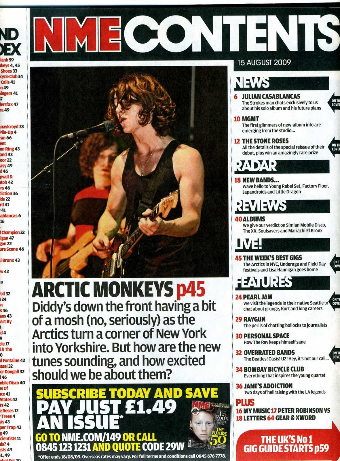
NME


This Contents Page is in many ways opposing to the previous contents', due to the fact that on this one there is a lot more information and content on the page. Having both the magazine title in the original red and white lettering while also having the title of 'CONTENTS' causes both promotion for the magazine and reminds the audience as to what they are reading (as if they would forget). By using grids on their magazine contents, NME creates a certain structure and order to keep to conventions. This divides the subjects while making the page seem hectic and interesting. The language in the page is informal to try and relate to the target audience, the lack of diversity in font makes the text easy to read no matter who it is. The advertisement at the bottom of the page stands out dramatically, thanks to the contrasting black background compared to the standard white, to then the use of yellow and white text instead of black. Unlike the previous magazines, there is no connection with the artist as the artist is in mid performance. With the palette, by using basic colours, this eliminates a specific audience and tries to relate to a wide range of people.

Cover Analysis'


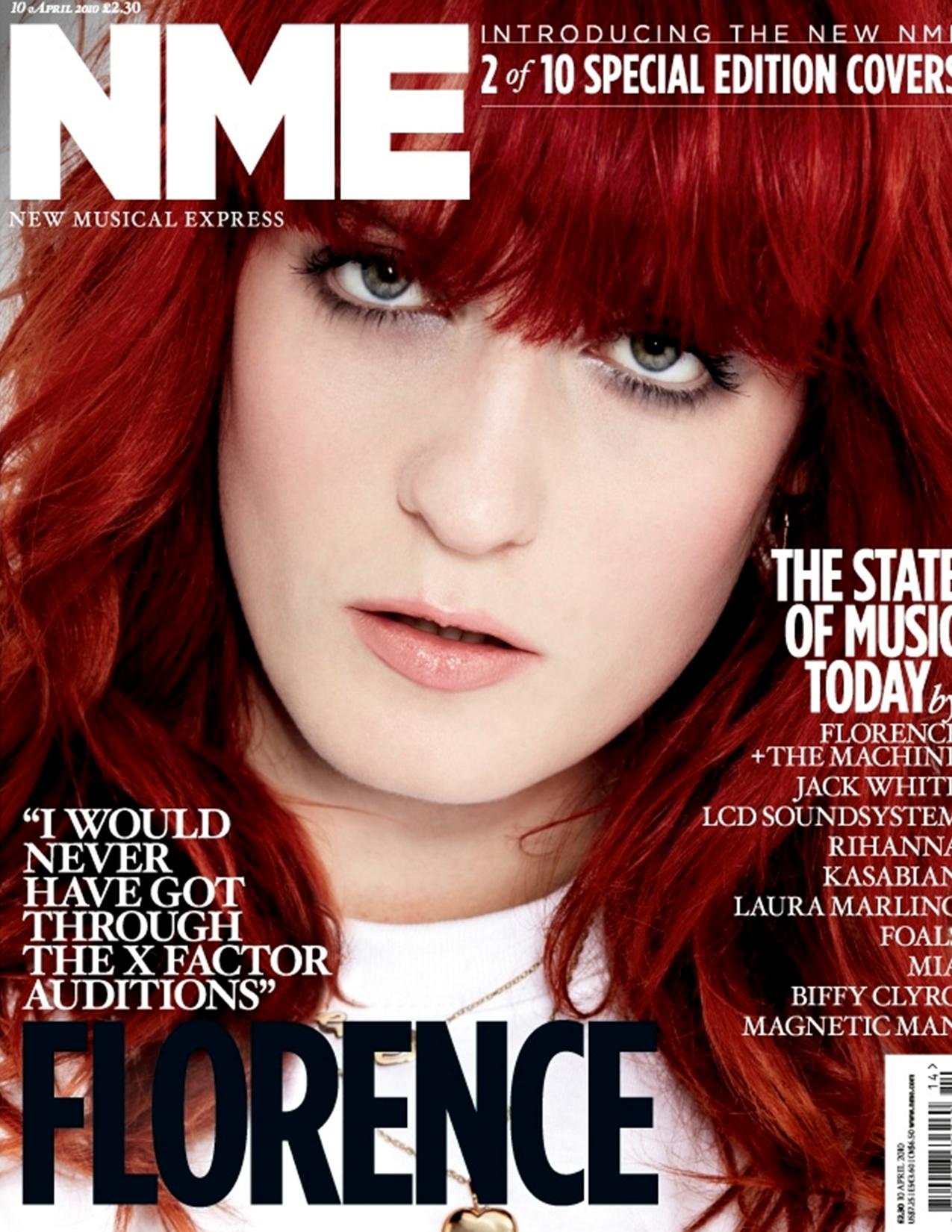
NME - Special Edition


The title of the cover has kept the original font, however the new colour of just pure white which makes it stand out and is effective due to the fact that the use of a red font would inevitably collide with the hair colour of the artist. The page itself is interesting as not only does the artist itself make a relationship with the reader by having eye contact, but the informality of the term 'florence' produces a certain comfortability with the reader. The close up reinforces this comfortability as the only time you would be as close as the reader is, is in person. The general layout of this cover is minimal but also quite formal, this gives me a few ideas for my own magazine.


NME #2


This cover is interesting. The top of the page has a list of music artists of a certain genre, while the main artist is of a different genre, this may be a marketing technique to widen the audience. The central image itself is very attractive due to the fact that the background is very complex with a large collection of colours while the artists clothes are very simple, with a simple white vest and gold chain. His eye contact and wide smile creates a very positive connection with the reader, even though the background would not be a factor in my magazine, the positive connection with the reader is something i will aspire to. His wide arms also may be a technique to try and make the reader feel that the artist is very open and relatable. The quote on the bottom left is in a very informal way which makes the younger target audience feel more comfortable and gives them a dialect to relate to. This will then inevitably intrigue the audience and make the reader feel a certain need to read the magazine.

Billboard


This cover is very attractive for many reasons. For example, the big black font contrasting with the bright pink background makes it stand out. Speaking of which, the pink background emphasises the female target audience while keeping a very strict palette of pink, black and yellow, this collides with what the artist is wearing. Like most of the pictures of artists, the artist is making eye contact with the camera in an attempt to make a connection with the audience. The vibrant colours make the magazine stand out and create an attractiveness to it.